*I have worked for 2 years on this product, on multiple features. This case study is just one feature from that product.
About
A HIPAA-compliant patient-centric communication platform, where doctors and nurses collaborate over a channel regarding patients to improve the overall care-giving experience.
The Challenge
One of our major target markets is the Hospice Industry. On average, a hospice center will have 148 patients with 10-12 patients assigned to a nurse. For this example, we will consider a nurse as our user:
Currently, our users are experiencing problems in reaching the cases that need their help;
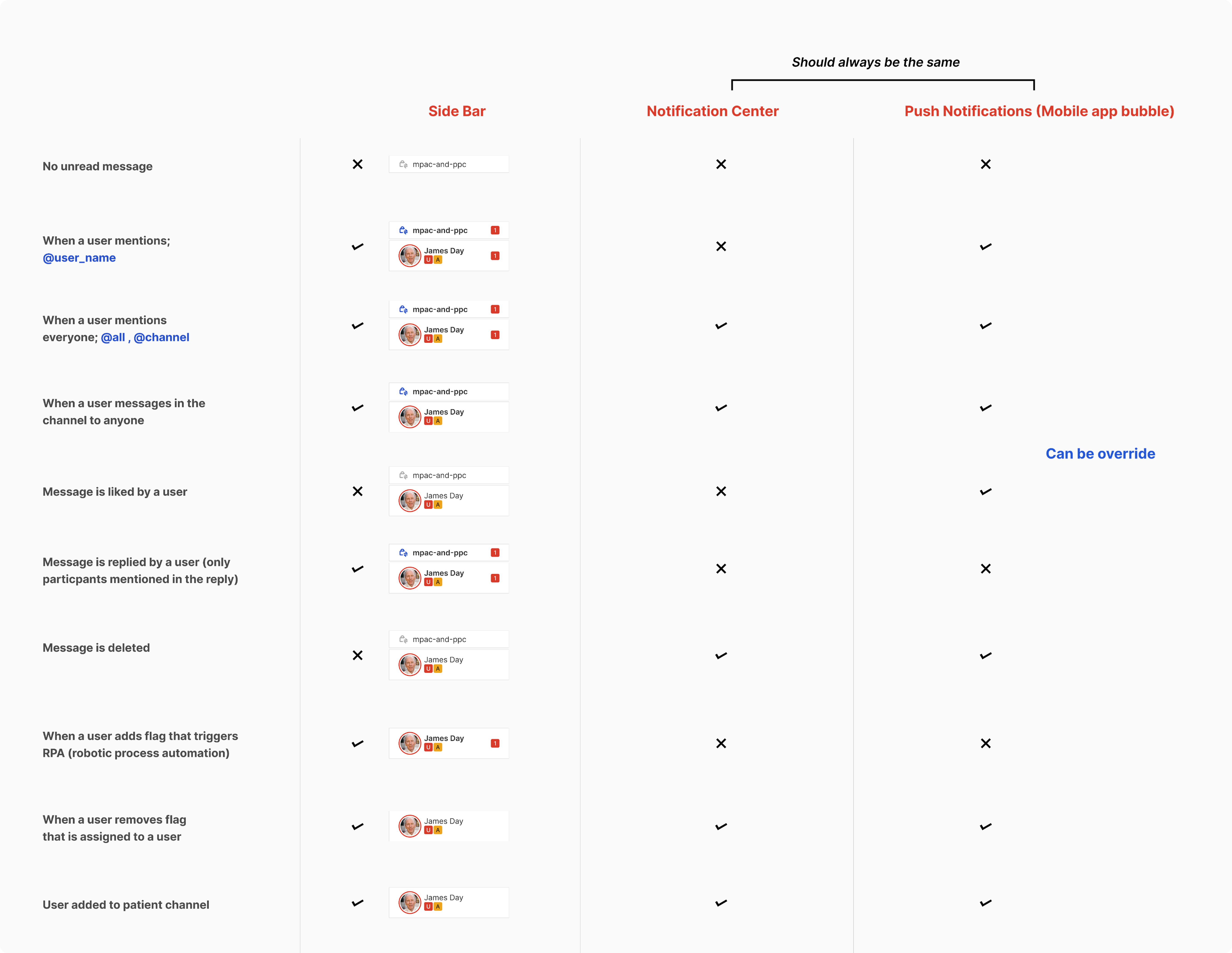
- Some users are getting too many notifications while others not getting enough
- Users get agitated when the number of notifications doesn’t match between the notification center, sidebar, and app icon bubble count
Understanding the problem
Research was done to find out how people used the current notifications in their work life to find insights that could help us improve the experience.
Different roles (Admin, Nurses, Doctors, Patients) believe different things are important
We understood there are reasons for practitioners to receive certain notifications even though they didn’t find them useful. It was about getting to know others' perspectives.
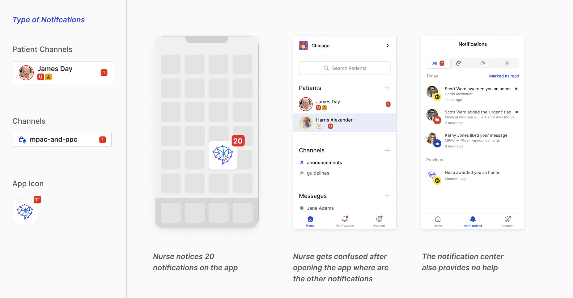
Inconsistency in the number of notifications in the App badge and notification center
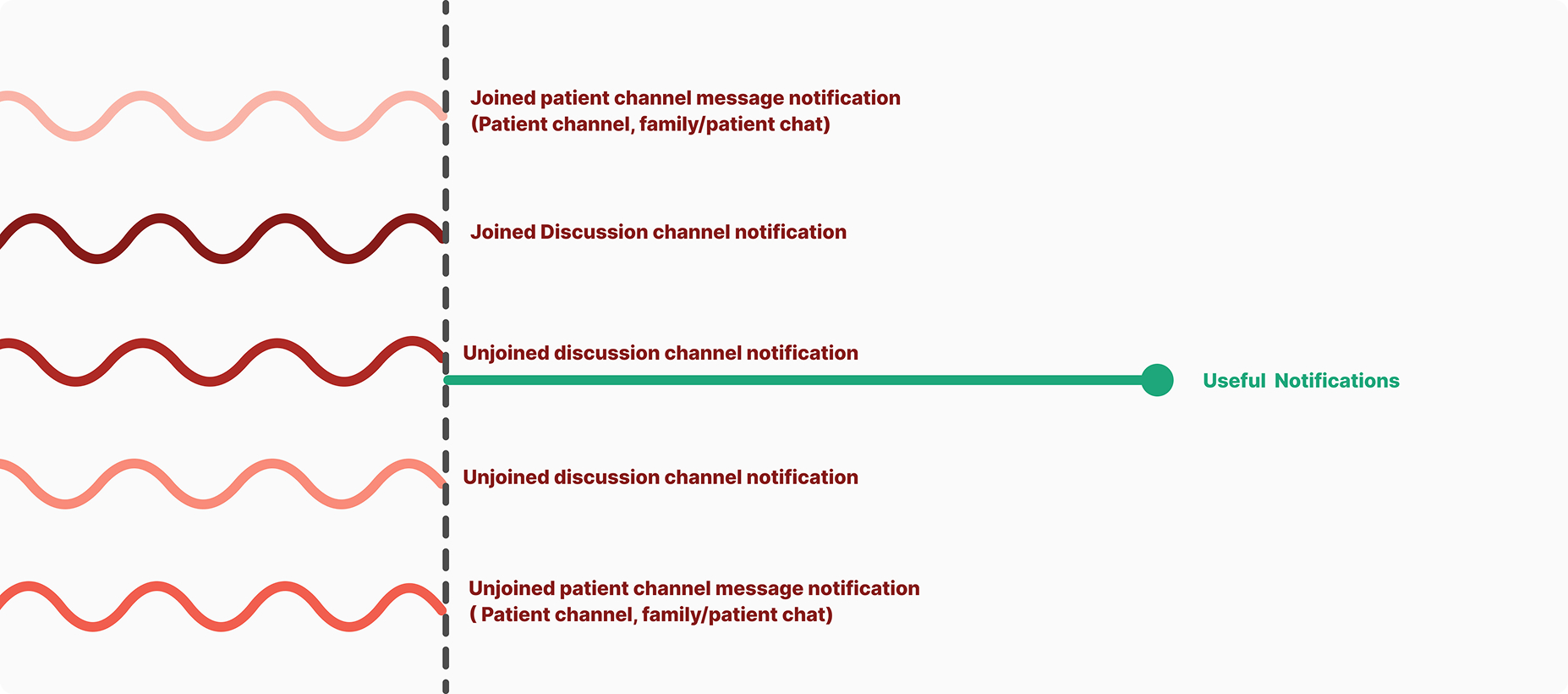
Current design implementation has problems showing different numbers of notifications on the app icon, notification center and on channels. Re-think about what instances should be notified about.
Since there are a lot of notifications and not much thought was put into finalizing them in the previous version of the app. I decided to identify all notifications in the app, where they appear and how they would appear in the app. And then decide prioritize them with the stakeholders and power users.
Users are using the notifications as reminders/bookmarks in the app
We noticed that people receive a large number of notifications, and some of these are also used as reminders and to track updates. This highlighted the need for a more organized system, similar to call logs.
competitor analysis
Solution
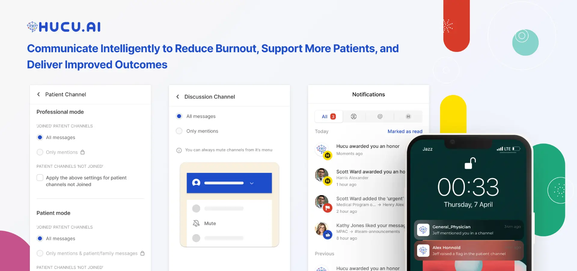
Giving the user the ability to set notification preferences with default settings
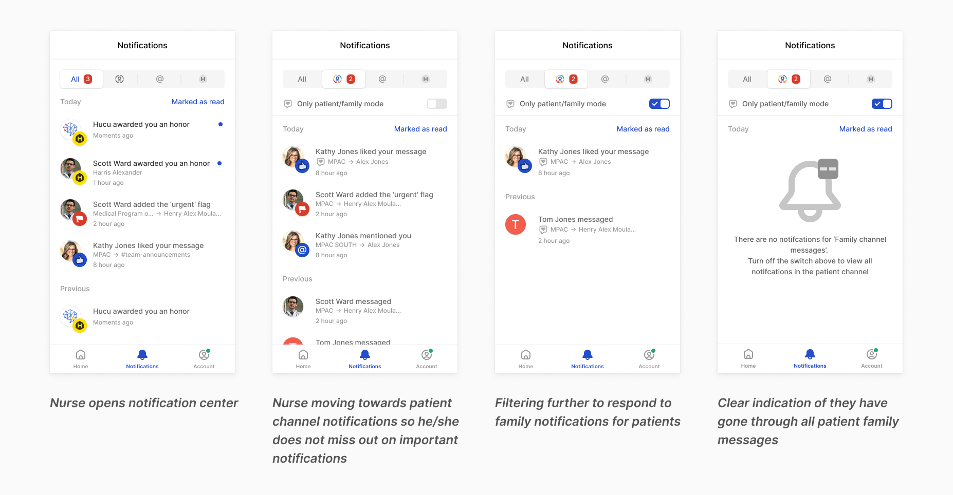
Currently, the way things work, only the ticker-worthy things are shown in the notification center and in the sidebar menu with a clear red ticker. We want people to have control of the instances when they receive a notification. Interviews with users deduced a default setting.
Previous Design
Improved Design
Currently, the notifications are drowned in the “All” tab, which contains Hucu honors (reward points), discussion channel messages, direct messages, and flag notifications. Adding a patient channel tab will filter the patient-centric notification. These notifications can further filter the notifications into family/patient chat.