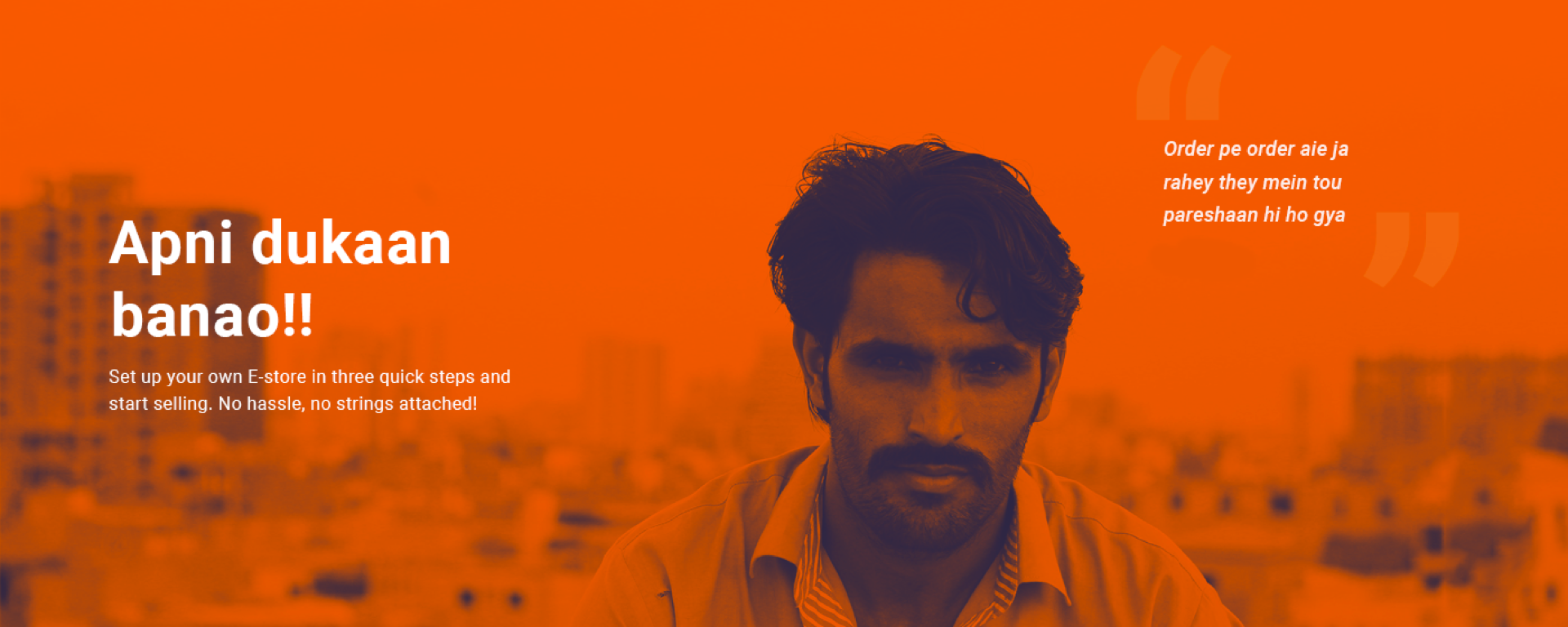
About the Product
Firefly is a e-commerce enablment platform based in Pakistan, where you can create your website, add products and start selling them. It has a automated order fulfillment process and is integrated with couriers as well as with different payment gateways.
The Challenge
The current product had some form of interface, which enabled the company to build the websites for their clients. But they wanted to make it a self-service product, where user could make a website and on-board products by themselves. In order make it a self-service it was imperative to design a customer on-boarding process.
Although there were similar products in the international market, but they were expensive and in accessible (problems with payment method) for the local market. There was a need to make the product that was simple to use, since, people in the country are not that tech savvy.
This product had been scrapped a while ago, so, there was already some back-end architecture in place. And it was up to me revive the product with the help of developers and product manager.
Target Audience
Since, Firefly is an e-commerce platform for people in Pakistan. I narrowed down the target audience to two types of group.
- Small merchants who are not so tech savy and are open to new channels to sell their product.
- People who use Instagram to sell their products.
Research
Interview Questions
It was easy to empathize with the target audience since I had worked and observed the first demographic for two years, during my time as a associate manager in a off-set printing press . I used my contacts to help me get relevant people.
I interviewed 13 people from a small-time cobbler to people who sold export stuff in markets, with these questions:
- Do you know what is an e-commerce website?
- Do you think, an e-commerce website would be a good channel to sell your prducts?
- What would it take for you to try this channel?
- How much would you pay for this service?
- What features would you like in this product?
Key Insights from the interview
- Older generation would prefer their kids to be able use the product.
- People would prefer a session with the product desigers, to explain the design and benefits for the product.
- People would not like to pay with a debit card, since some of them don’t have a bank account.
- People need a lot of options for the templates, inspired by huge fashion brands.
- People are more likely to make a website if someone else made it, and is making a profit. Even then, they will not put much effort in making it.
Competitor Analysis
I started my research by studying user on-boarding for different platforms. I used the followed useronboard, which tear downs different steps and spots the areas that need improvements in the process. It really helped me learn the customer on-boarding process for Shopify. I took the same approch for squarespace, wix, big commerce, volusion & 3d cart.
Here are the similarities I found in the customer on-boarding:
- It starts with the home page which has an assertive heading and a sub-heading.
- Then there is some social proof on the home page.
- The call to action button leads a preliminary form where you have to register.
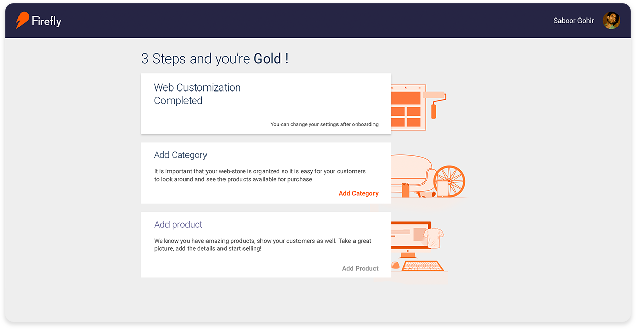
- Then the user is taken to web application where user does the following;
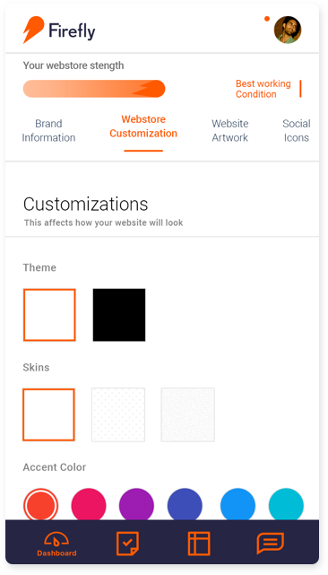
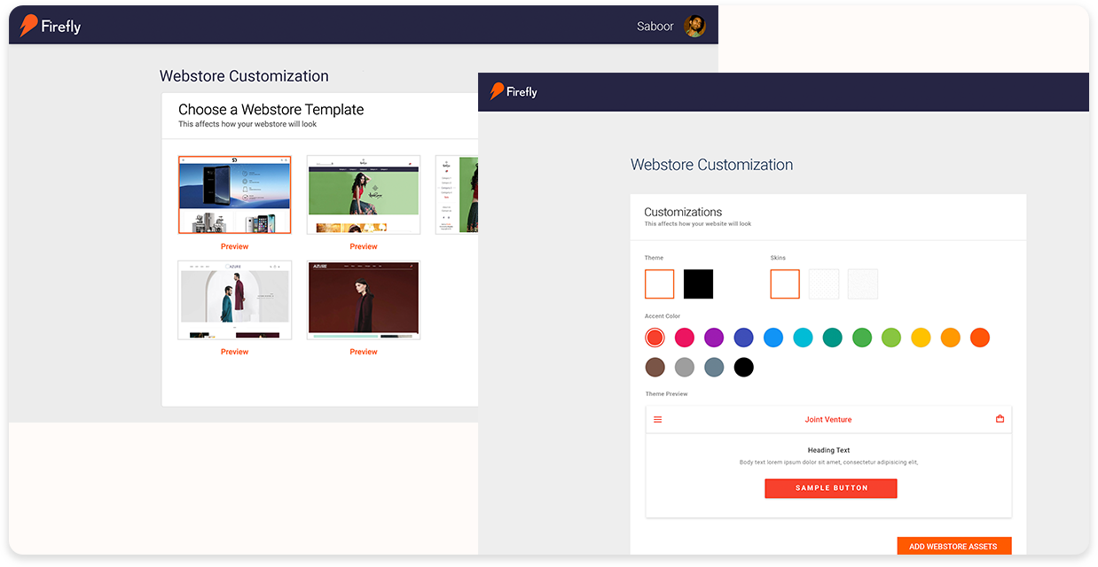
- Selecting Theme & Customizing website
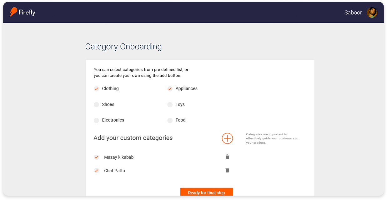
- Manage categorires
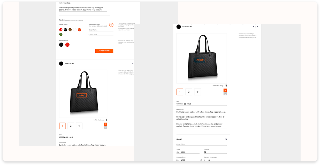
- Add your product.
Problem Solving & Wireframing
After Interviews and the research, I started designing the on-boarding process for the product. I considered all the tear downs from ‘useronboard’ while designing the process. Apart from that I made a list of practices, used by some of these platforms that could help me produce a easy customer on-boarding.
During wirframing I took these considerations into account:
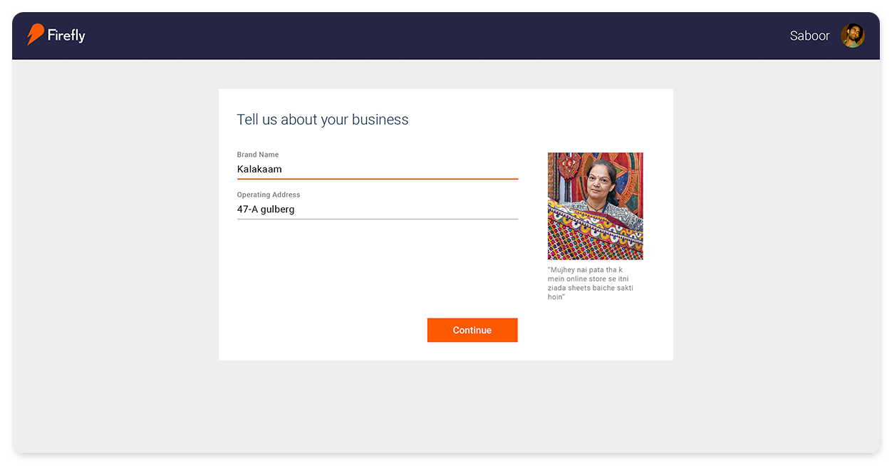
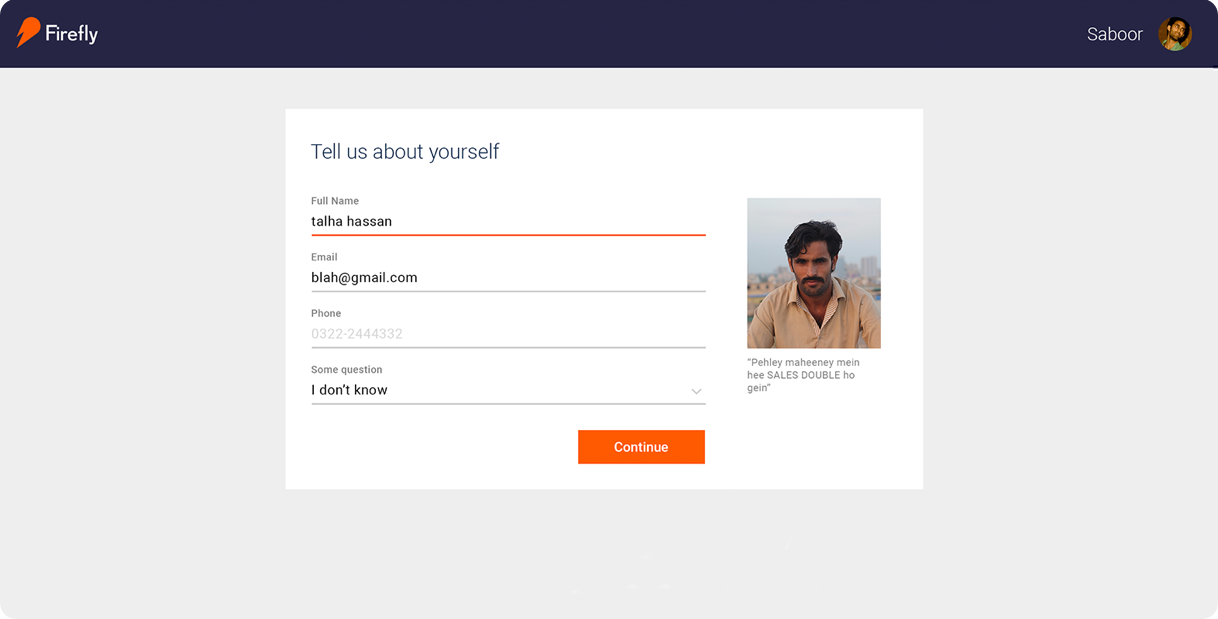
- The on-boarding should be divided in several steps, there should no long forms
- There should be social proof along the way
- Some visual cues that would help the user to understand the step
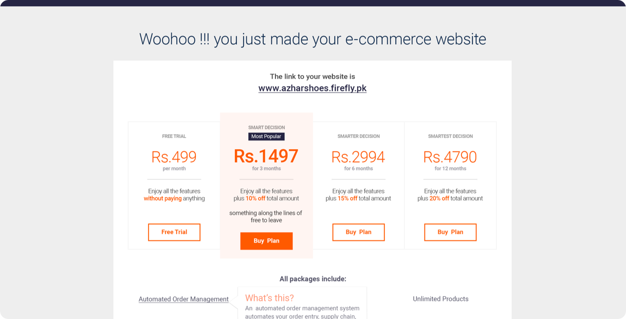
- Highlight the pricing section as well as ‘Free Trial’
- Minimal interface design
While coming up with solutions & wirframing I sat with the developers and confirmed each decision I made with them. I also constantly tested the flows and wireframes with the people in the office, since we were sixty people strong. There were a few of them who were already selling some products and would most likely use the platform, if it was available.
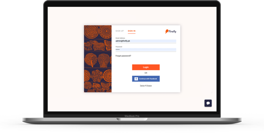
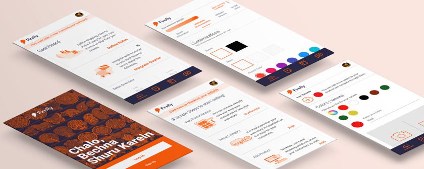
Hi-fi Mockups
Since the product already existed, I had a style guide to play with and design the interface around it. When the wire frames were completed, I started working on high fidelity mock-ups. I used Photoshop to come up with different illustrations for the web application and Sketch to make the user inferface for the application.

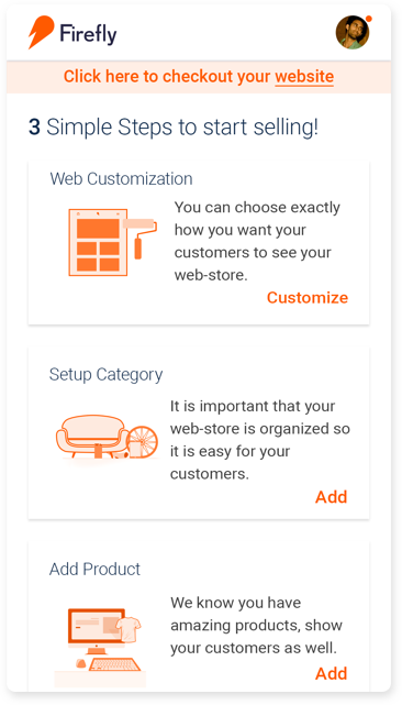
New On-Boarding Process
The following was the new on-boarding process, along with it is the thought process of why I took certain decisions.
User Testing
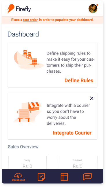
After the on-boarding process was added to the product, we conducted a user testing. The purpose of the test was:
- To see if the onboarding process was adequate for our users
- To identify pain points in the current on-boarding process
- To observe and listen to their feedback, in order to come with addtional features to ease the process
- To get feedback on the current templates, since it turned out to be a deciding factor in people
- deciding to use this product, during my ‘unofficial interviews’
- To check out bugs in the prodouct that might come up
Methodology
People were asked to make there own website by visiting Firefly.pk and make their own e-commerce website. Each of them were given laptop with a clean desktop except with a ‘Website assets’ folder, to help them with on-boarding.
After the test, they were asked to fill out a feedback form. The form included these questions:
- What do you hope to achieve from this session & product?
- What do they expect of the product?
- What problems did you face?
- What can be done to make it better?
- What features are missing?
- What is the likelihood of you using this product? On a scale of 1 - 10
- How do you feel about the overall experience of this session
- any improvement?
Results
- Completed webstore: 90%
- Understand payment plan: 95%
- Select courier service : 80% (did not have desired courier)
- Select Shipping operations: 60%
- Try out different templates: 70%
- Place test order and checkout their webstore: 90%
Observations
- Theme preview experience should be improved.
- Color seclection interaction needs improvement.
- ‘Add Custom Category’ needs better interface.
- Some bugs (mentioned in the report) need to be fixed.
- The ‘Settings menu’ interface in webapp settings needs to be improved.
- Some of the fields (mentioned in the report) need their copy to be re-iterated.
The problems were explained in detail in the user-tesing report. After the testing, sprint to improve the design was made on trello. We had a meeting to prioritze the problems and started our work on improving the product.
Reflection
It was challenging to work on a product, which had it’s architecture laid out without keeping the design in mind. People with different cultures and different socio-economic background require different UI elements to help them understand the product.
Note
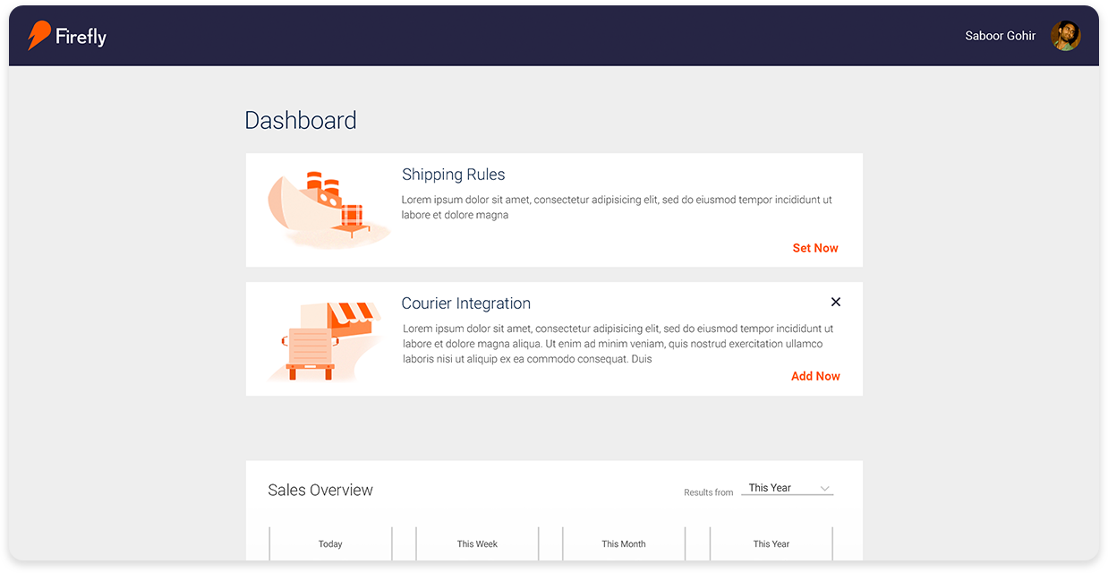
I have worked on different parts of the product i.e user on-boarding, product on-boarding, website templates, dashboard, order management, expanding the product to services apart from physical products, but this article only describes the process behind the on-boarding.