About the Client
Blocket Utbildning was launched as a marketplace for further education. It is a listings site for vocational courses (yrkesutbildningar), colleges (högskolor), universities and other private further education.
The Challenge
This is my ‘UX module’ project at Hyper Island, Stockholm. I had to work with a group of people, focusing the deliverable, while practicing group development, creative processes and leadership.
To gain an extensive amount of insight into the potential users of blocket utbildning and improve their journey to finding education through the Blocket Utbildning platform.
We took the Design thinking approach to come up with insights that we could use that aligned with the company's objectives and technological capabilities.
To come up with one feature that would set Blocket Utbildning apart from the rest of the listings sit on the web.
Research
In the research process I concentrated on what other competitors were providing the users. Also, importantly what is a users’ journey from the time s/he feels s/he wants to get an education to the time s/he joined the school. What were their emotions and individual stages?
Research Goals
- How many blocket verticals are connected to education or can be connected?
- What are the key info points about a school, user looks on the school detail page?
- Different channels to get info on the education from?
- What do people look for in an education?
- On what grounds do we make decisions?
- What facts are needed when comparing education? What weighs more heavily?
Before going to interview users we made some assumptions and listed them down, in order to structure questions around them and to verify them.
For the scope of this project we narrowed down our audience to professionals who were looking to re-educate themselves or build on their previous skills and were interested in vocational studies.
Assumptions
- People need to talk to other people in order to make a decision about universities.
- People will be interested in talking to a School Representative/Alumni.
- People need information about the opportunities after school, to develop more interest.
- People ask other students going in the same course for help.
- Professionals need more help in finding a place to study than students.
For research purposes I went to two vocational schools and asked students their journey to reaching that school. The interview consisted of them;
- Marking their stages in reaching the school (Blue Marker)
- Highlighting areas in their journey that might need improvements and how to improve them (Green Marker)
- Drawing their emotions with an emoticon or by writing them (Red Marker)
All the interviews were recorded, in order for them to be reviewed in depth later on.
User Journey
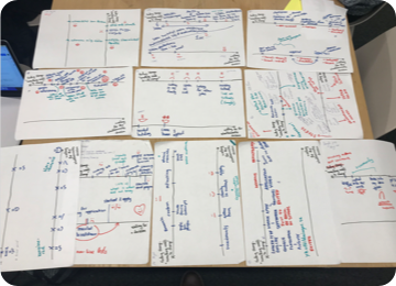
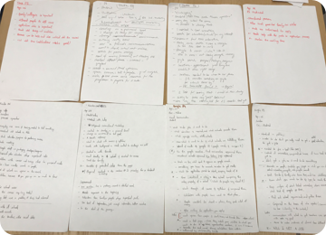
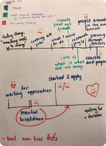
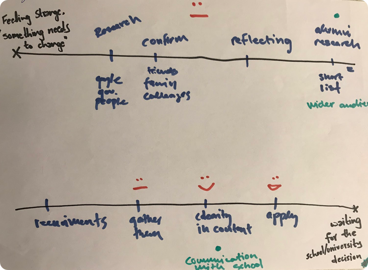
From these interviews we came with an average user journey as well as average mood graph for professionals looking for an education.
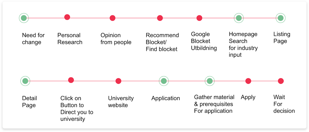
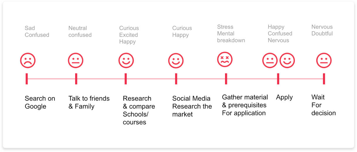
I went through the interview recording, made my notes and highlighted the part I felt should be taken into consideration for the scope of the project.
This allowed me to come up with some key learnings shared below.
Key Learnings
- Waiting for application approval is a stressful period.
- Some people need to talk to alumni to have a better understanding of the school.
- Contacting school representatives or going to open houses played a key role in informing the student on their decisions.
- Not understanding the course name and having description clarity was a common feeling among participants.
- Validation from friends/family is a deciding factor for education for the majority of people.
- Coping with school requirements was hard for some students as they were unsure of what the school wanted from them.
From these key learnings we had some insights
- People need to reaffirm their choices with close ones.
- People need guidance in the process of finding education.
Ideation
After we had the insights we did an ideation exercise called ‘Crazy 8’ to come up with solutions revolving around these insights. Once we had a rough idea we involved the client to help us fit our ideas on the ‘Feasibility vs Impact’ chart.
Involving the client helped us gain first hand knowledge about the company and it’s verticals and allowed us to place our rough ideas in the correct location in the chart.
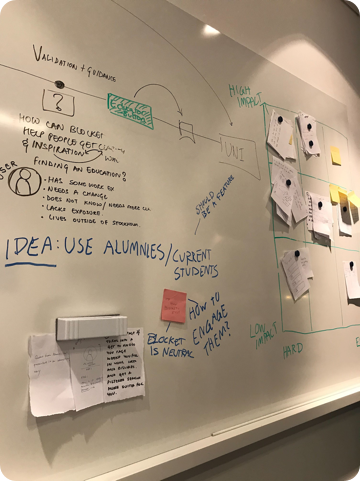
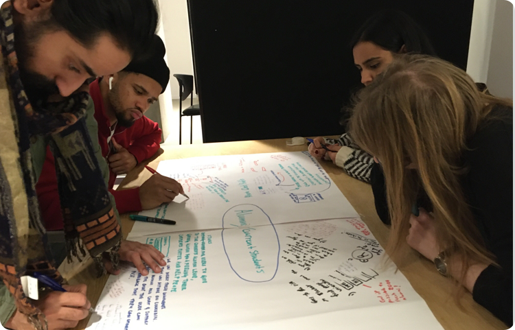
After the workshops and client’s input we got to the conclusion that for this time period we need to focus on one idea to add value to the current product. To clarify things, we came up with the focus question.
“We need to find a way to help people get a good insight about a school and future opportunities”
I gathered the team to do another ideation workshop called ‘Speed Dating’ where we build on each others ideas. After this we came to a solution.
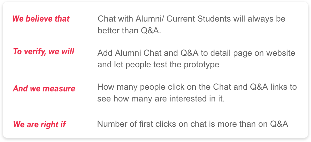
Two ideas were selected from the ideation process and were tested against each other
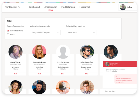
- 1. Chat with Alumni
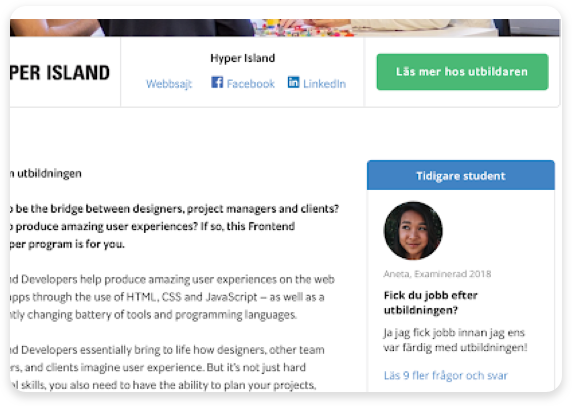
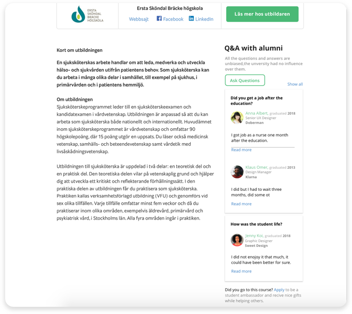
- Question and Answer answered by alumni
Prototypes & Testing
We divided ourselves into two sub groups, created prototypes on sketch and tested it with people. Since we didn’t have a lot of time so we used the current MVP and tweaked it according to our vision.
We created a “Test Card” to help us with the testing.
Key Learnings from the tests
- A Q&A could potentially add value to people's experience of Blocket Utbildning
- People wanted more alumni giving the Q&A
- They wanted more questions on the Q&A section
- The Unbiased-part needs to be more clear
- There was a need for credibility of the alumni contacts
- Users wanted to be anonymous
- Users felt uncomfortable with a real-time conversation
Prototype Insight
“Chat was not the prefered way of making contact. Some people wanted help with their questions but they found it difficult to ask and have a conversation.”
We analysed the key learnings from the testing and came up with improvements such as;
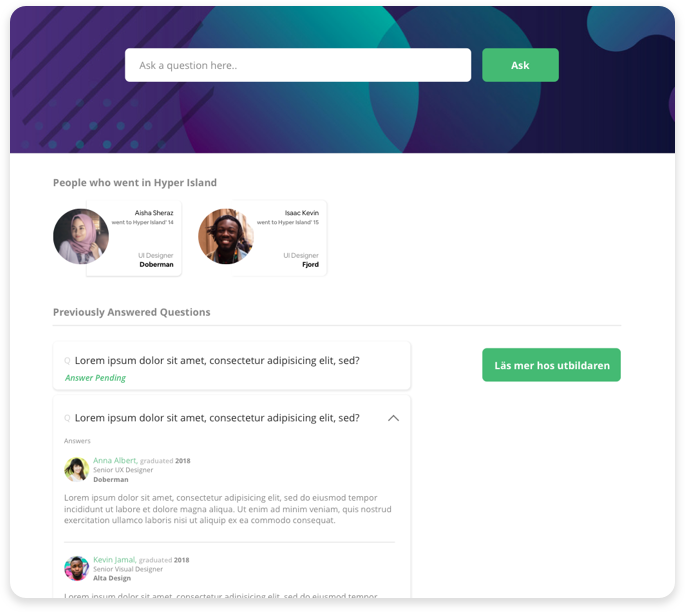
- Create an interface that has alumni with their picture, name, year of graduation, where they work and their title. With this information the user might be able to determine their credibility e.g based on their position in some company
- In that interface they will be able to see all the people who could potentially answer their questions as well as previously answered questions.
- When asking questions they won’t need to converse with other people.
Conclusion
If I had more time, I would have liked to narrow down the users that the company would like to consider while launching the product. Then I would conduct a user test with this prototype to see if this feature is truly intuitive. I would like to improve the UI design. We didn’t spend time on that since we didn’t have much time for this project. Apart from this I would have liked to have access to Google Analytics account to observe a user’s journey on the website. This would help me better understand where to introduce the Q&A section on the details page or maybe rethink the placement in the user journey. It could inspire me to introduce new features which might help improve the product.
