I had almost 5 weeks to convert an idea and rough information about features into an app with wire frames and final mockup with no resourses for user interview or testing.
The Challenge
The idea was to make an app that allowed people to call a ‘badcall’ in a live match or an old one, in a swift manner. And publish it in a forum where people could debate about badcalls simultaneously showing off their knowledge about the sport.
Research
With no time to lose, I dived into apps that showed live scores, highlights, commentary for different sports. These apps included theScore, Thuuz & 365 sports.
I went through each app and went through their on-boarding and features they had to offer. I studied the UI for the sports app since i never made a sports app before i needed to learn what vital information is to be shown on the cards in the app.
Defining Goals
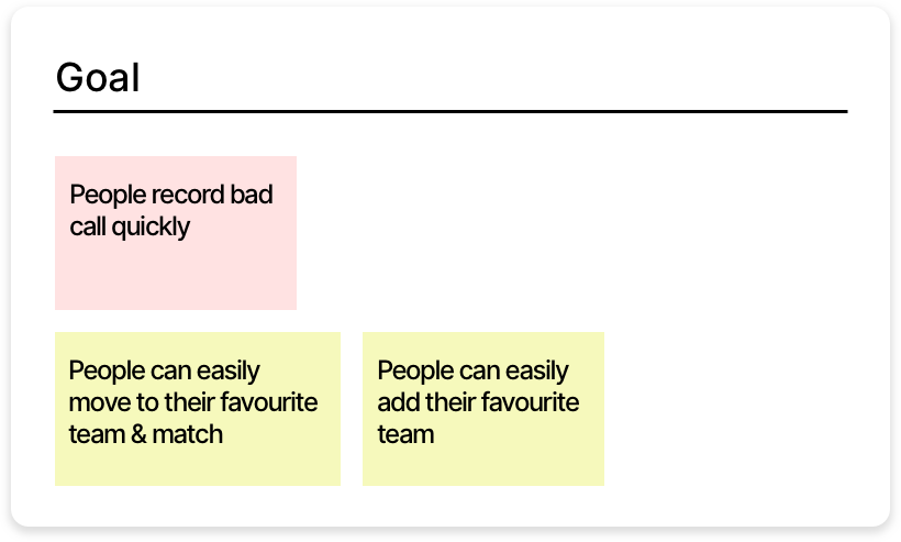
From the brief and discussing with the product manager, it was decided to work on the on-boarding, ability to post a bad call easily in real-time as well as in an old match.
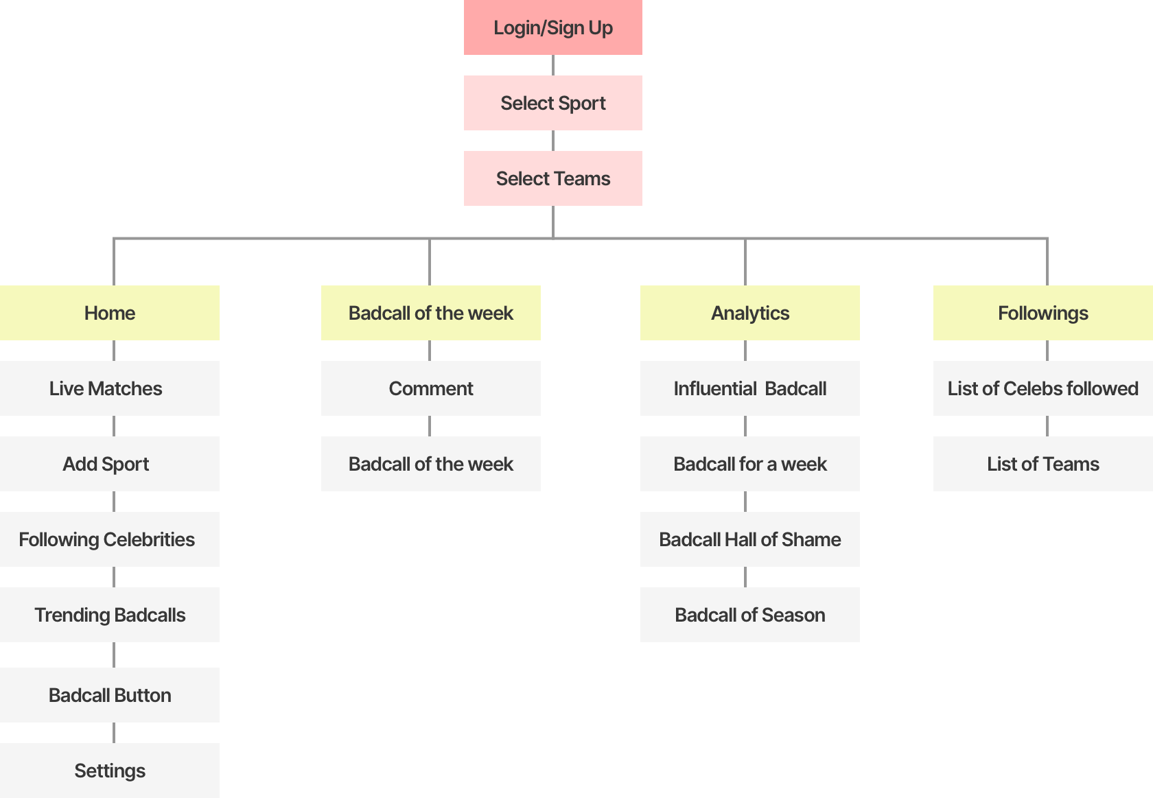
Flow for the application
Wireframing
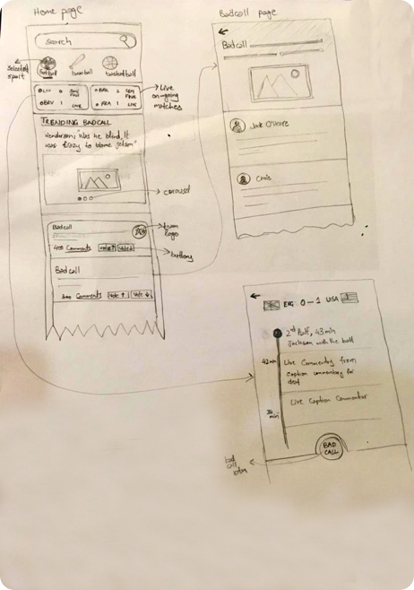
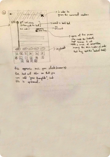
After the flow for the application was finalised, I moved into wireframing. During this process I tried to find as many ways to reach the goal as possible and constantly evaluated the whole app. All the improvements and new features I came up with, were put in the “Garden” (a magical place where all ideas stay, to be further scrutinized or built on), which I later shared with the project manager.
Since I didn’t have time, I only made them on paper. This way I consistantly reiterate my decisions. Wireframing helps free my mind, since it’s quick and I concentrate on solving the problem instead of worrying about making it look perfect.
Then, I discussed the wireframes with the product manager and got a go head for the Hi-fi mockups.
Hi-fi Mockups
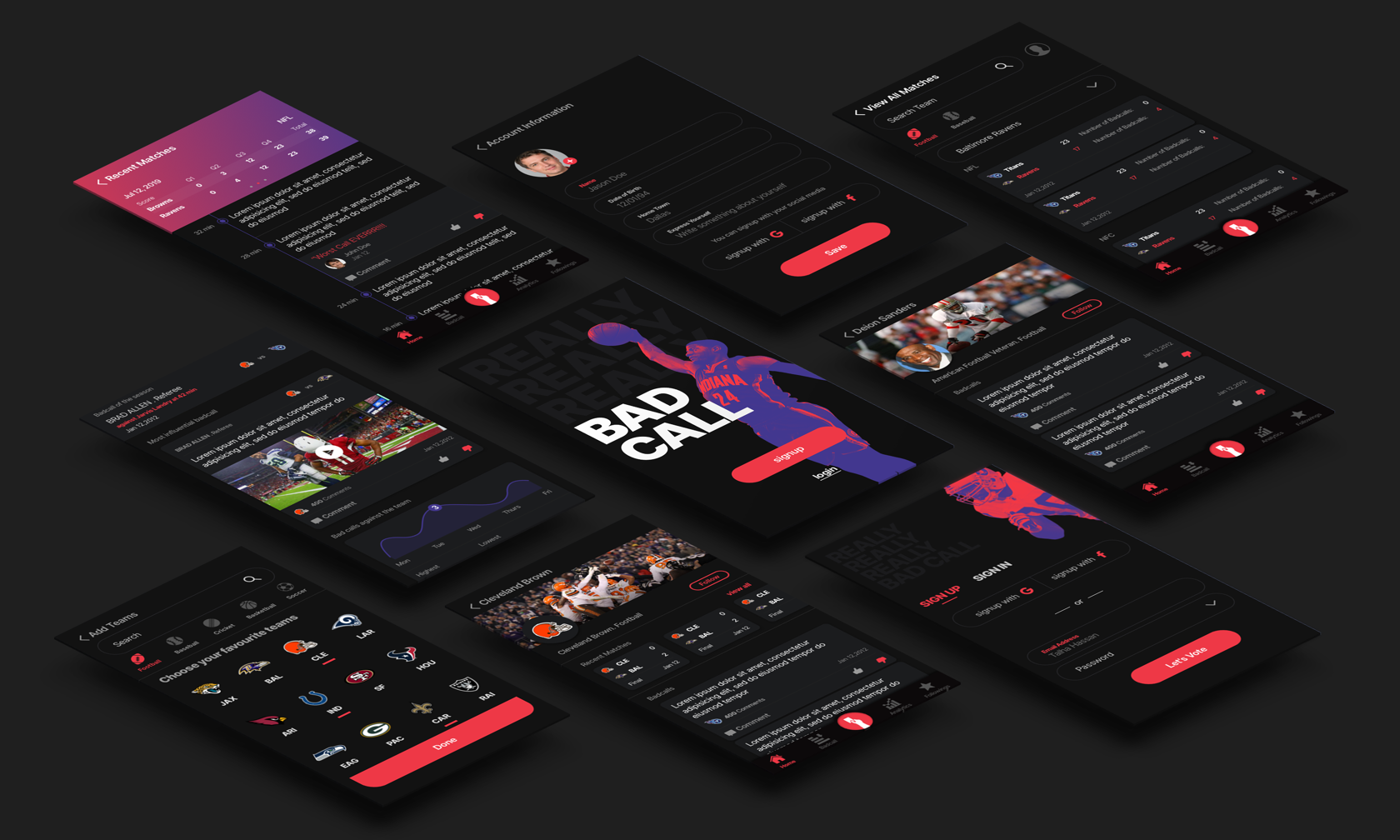
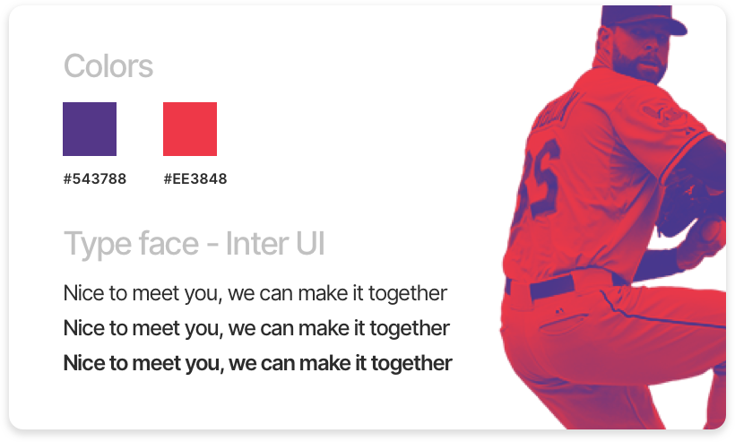
After the wireframes, it was time to come up with a mockup. I started the project with temporary logo, style guide and visual design due to delay in the communication with client.
I researched different sports apps and experimented with colors and fonts till I reached a good match that made Badcall look modern and stand apart.
After this I dove into Sketch where I made all the mockups and Photoshop where I played with some gradient mapping on some images.

Prototype
Reflection
Working on a side project with a job can be a daunting task but not impossible. I was fortunate to have a good project manager to bounce back ideas with. We had 1 - 2 meetings per week which included clarity on the app and feedback. For me it was odd to work on application with almost no user research and competitor analysis of potential competition, but a product had to be made.
I learned it’s alright some times, to start with the visual design before wire frames, flows and information architecture.
I could have liked to do some user research and interviews with sports fanatics in the country, to get their prespective on the idea, but unfortunately there was lack of time and resources to work on it. Some user testing with wire frames would not have hurt. I could have also balanced my time better between UX & UI design for this project.
